Mama’s Tuak

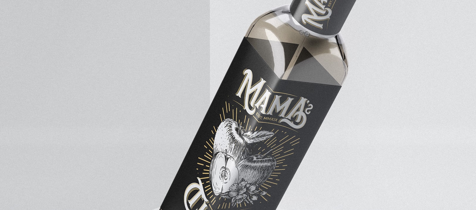
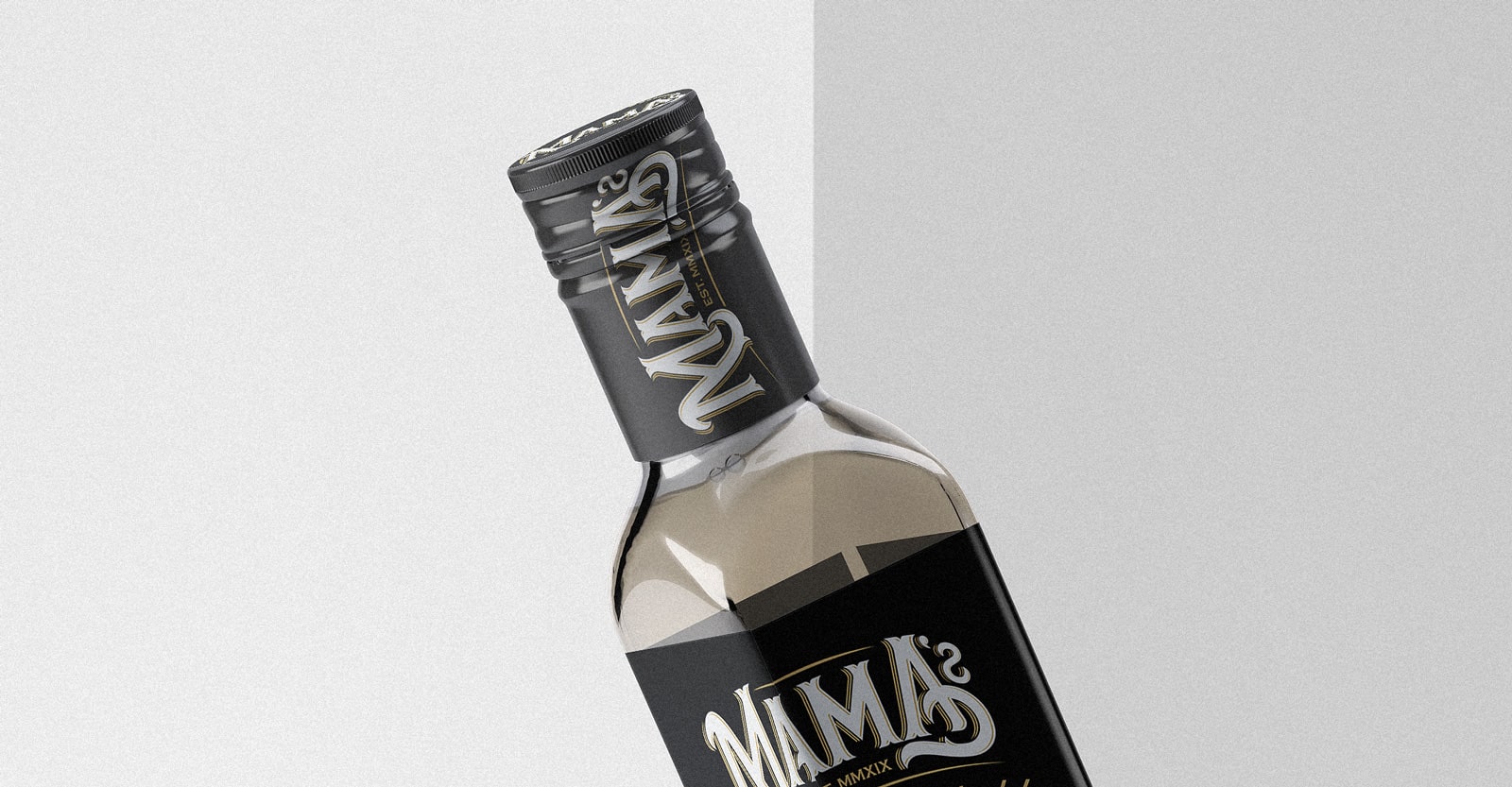
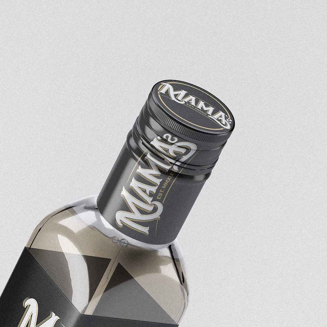
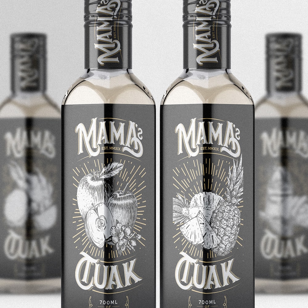
Rooted in culture and family tradition, this project was commissioned by a local Sarawakian liquor brand now based in Kuala Lumpur. The only directive at the start was the word “Mama”; a nod to the founder’s mother, whose homemade tuak recipe forms the heart of the brand. From that single word, a whole identity was born, capturing warmth, authenticity, and craft.

Branding the brew
of generations
The design direction, dubbed Heritage Modernism, marries traditional motifs with contemporary clarity. Each label features detailed, hand-drawn fruit illustrations specific to the flavour variant, giving every bottle a personal and artisanal touch. The typography was custom-tailored to convey vintage charm with a bold edge, while the black and gold palette grounds it in modern premium aesthetics.
Special attention was given to every detail, from the typeface on the bottle cap to the subtle radiance surrounding the fruit art. This handcrafted essence reflects the care that goes into every drop of the drink itself, aligning visual storytelling with the product’s origin story.
Privacy is valued, and all personal information is protected. No personal data is collected through this website. Access to the site and services does not require providing any personal information.
All Rights Reserved © 2026 Ilham Nadzmi